I'm participating in Kristin's Summer of Color Challenge for my third year.
I decided this year to do some 3D style mixed-media projects - specifically - altered bottle art. These were finished timely, but I've been sick (yes, head cold round 2) so I'm very late posting. And to my regular readers... I'll be offline the rest of this week - traveling to visit the inlaws.
Week 3 - lavender plus violet plus yellow:
Week 4 - burgundy plus red-orange plus metallic (gold):
The "lid" is actually a filigree drawer knob, held in place with several rounds of packing tape! This was originally a vintage cough syrup bottle. Have to say that this one currently holds second place behind the sea glass one in my heart!
Showing posts with label Summer of Color. Show all posts
Monday, July 6, 2015
Friday, June 19, 2015
Summer of Color - Weeks 1 & 2
I'm participating in Kristin's Summer of Color Challenge for my third year.
I decided this year to do some 3D style mixed-media projects - specifically - altered bottle art.
I saw my first altered bottle at the Frisco Mercantile in April with Melissa. I was quite taken with the concept. Since then I've been collecting bottles at flea markets for between 25 cents and about $3 a piece. I won't pay more than the $3 for a base for a project. Anyway....
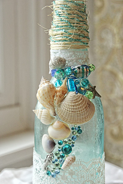
Week 1 - 2 blues + 1 green. I chose a sapphire blue, a turquoise blue, and a lime green:
This took me awhile and I got side-tracked with a nasty summer head cold that's had me out of commission for about four days. But I finally finished!
I used decoupage to adhere the lace and twine and used hot glue for the shells and beads. I actually bought a necklace at the flea market for $1 just so I could take it apart for the beads and charms!
Here's a close up of the detail:
Week 2 - 2 pinks + 1 orange. I chose baby pink, fuschia, and a bright coral-orange:
I'm not really sure about that fuschia ribbon at the top. Help me decide! Do you like it better with the ribbon....
Or without the ribbon???
Here's a close-up of the yummy detail.
Keep in mind, these bottles have been washed. But they are old and imperfect and I really like them that way!
I decided this year to do some 3D style mixed-media projects - specifically - altered bottle art.
I saw my first altered bottle at the Frisco Mercantile in April with Melissa. I was quite taken with the concept. Since then I've been collecting bottles at flea markets for between 25 cents and about $3 a piece. I won't pay more than the $3 for a base for a project. Anyway....
Week 1 - 2 blues + 1 green. I chose a sapphire blue, a turquoise blue, and a lime green:
This took me awhile and I got side-tracked with a nasty summer head cold that's had me out of commission for about four days. But I finally finished!
I used decoupage to adhere the lace and twine and used hot glue for the shells and beads. I actually bought a necklace at the flea market for $1 just so I could take it apart for the beads and charms!
Here's a close up of the detail:
I'm not really sure about that fuschia ribbon at the top. Help me decide! Do you like it better with the ribbon....
Or without the ribbon???
Here's a close-up of the yummy detail.
Keep in mind, these bottles have been washed. But they are old and imperfect and I really like them that way!
Friday, July 19, 2013
Mixing It Up - Post Five
But with a twist... I did NOT mix it up this week!
The Being Me theme for this week is happy and here is the page I made for that:
The background is a really fun technique that I will likely revisit. Just glob several colors of paint on your page and then spread with an old credit card or gift card. Creates a fun marbling effect! The color combo - lime green, bright yellow, and various shades of turquoise truly is my personal summer palette and the colors make me happy!
The Summer of Color challenge combo for the week is sage and sepia. And this is what I came up with:
The butterflies are actual lace. The owl is from a paper napkin. The "remember" is ribbon. The girl is a Unity stamp. All of the stitching is from an OLD set of rub-ons. I love the way this page came out and how the elements worked together. And I'm really going to miss this challenge now that it is ending. Working with specified color combos forced me out of my comfort zone and into areas that really allowed me to capture feelings.
The Being Me theme for this week is happy and here is the page I made for that:
The background is a really fun technique that I will likely revisit. Just glob several colors of paint on your page and then spread with an old credit card or gift card. Creates a fun marbling effect! The color combo - lime green, bright yellow, and various shades of turquoise truly is my personal summer palette and the colors make me happy!
The Summer of Color challenge combo for the week is sage and sepia. And this is what I came up with:
The butterflies are actual lace. The owl is from a paper napkin. The "remember" is ribbon. The girl is a Unity stamp. All of the stitching is from an OLD set of rub-ons. I love the way this page came out and how the elements worked together. And I'm really going to miss this challenge now that it is ending. Working with specified color combos forced me out of my comfort zone and into areas that really allowed me to capture feelings.
Wednesday, July 10, 2013
Mixing It Up - Post Four
![]() |
| click on the photo to see larger and read quotes |
The week five Summer of Color combo is candy apple red and yellow. Initially I resisted this color combo and had a hard time getting started because all I could think of was McDonalds (yuck!).
I created this page with a wash of yellow acrylic, layered on the b&w wrapping paper, red tissue paper heart, and white heart shaped doily. Then I used purple spray mist and dripped red ink. Added texture with yellow and orange acrylics. Added some word and music washi tape. Inked the edges of my quotes and applied them with gel medium, allowing some of the paint and spray mist to smear onto them. And then finished it off with some stamps with red ink. Nice and messy!
The week 6 Being Me topic is being kind to yourself, banishing negative self-talk, etc. I found a handful of quotes that I really loved to include with this page as personal reminders. You can click on the photo to make it larger and view the quotes!
Friday, July 5, 2013
Mixing It Up - Post Three
The week four Summer of Color combo is pale pink and charcoal grey. I created this page with a wash of pale pink acrylic and a little bit of "Diva Pink" for depth. The flowers and leaves are created with light modeling paste mixed with a couple drops of black ink to create a dark grey and then applied in a thin coat through a stencil. The quote was provided as part of week 5 of the "Being Me" course.
Wednesday, June 26, 2013
Another Mixing It Up post
Lime Green and Purple is definitely not a color combination I would normally choose to work with - a little loud for my taste - but I'm still happy with the way this turned out! This is Summer of Color week 3 combo combined with the Being Me week 4 assignment. I used a patterned paper napkin, bits of lime green and purple tissue paper, acrylic paints, rub ons, and a variety of pieces from the happy mail that Deb sent me.
Subscribe to:
Posts (Atom)