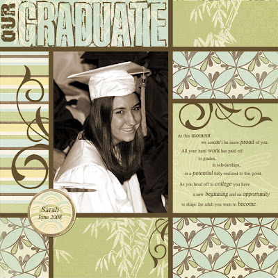
Lesson 4 from Up & Running. I think this was my favorite layout of all. We used multiple papers with a "snap to" grid, learned to change a photo to sepia using hue & saturation settings, and add drop shadows (it's very subtle on the circle with Sarah's name). Wow, that's a lot for one lesson!
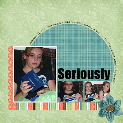
 Lesson 3 bonus project. Using a template. I LOVE templates! And the paper and elements for this layout are all Ettes & Co
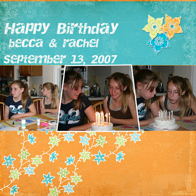
 Lesson 4 bonus project was how to create the 3 photo block using the polygonal lasso tool. JS left us totally on our own to finish it once the photo block was done. So I played with cutting papers to fit blank spaces using the rectangular marquee tool and drop shadows on the flowers in the upper right corner. Constructive criticism please? I'm not loving this layout.
1 comment:
Cute layout! This one really seems to capture their personalities too.
Post a Comment