
I decided this year to do some 3D style mixed-media projects - specifically - altered bottle art.
I saw my first altered bottle at the Frisco Mercantile in April with Melissa. I was quite taken with the concept. Since then I've been collecting bottles at flea markets for between 25 cents and about $3 a piece. I won't pay more than the $3 for a base for a project. Anyway....
Week 1 - 2 blues + 1 green. I chose a sapphire blue, a turquoise blue, and a lime green:

I used decoupage to adhere the lace and twine and used hot glue for the shells and beads. I actually bought a necklace at the flea market for $1 just so I could take it apart for the beads and charms!
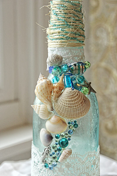


Keep in mind, these bottles have been washed. But they are old and imperfect and I really like them that way!
29 comments:
These are so unusual, and what a great way to interpret the activity - they are going to make a wonderful display. With the ribbon, in my view! But I love those tranquil seaside colours in your first one ...
they're wonderful! if I have to decide, I would use a smaller ribbon in a lighter shade of pink, perhaps the color of one of the pearls.
visiting from SOC, have a lovely day.
I like it better with the ribbon! And your altered bottles look absolutely amazing! So creative and very beautiful. I love the soft look of the first one using week one's colors, and I love the brighter look of week two's bottle, too! And yes, I agree - the bottles with their imperfections are wonderful! Thank you so much for sharing your talents with all of us! HUGS!
xo!
This is the first time I've seen anything like this. I LOVE that first one with the shells---such a perfect bottle to display in the summer. I prefer the bow, as well, on the second one, but also think I'd try a narrower ribbons. (I like the color of this one, though.)
I'm in AWE of your choice of materials for the SOC entries. They are phenomenal. Both are superb, but I think the pink ribbon should be smaller. It has a tendency to overwhelm the bottle. The first entry's shells are really perfect for a beach theme and the butterfly really holds your attention in the second one. Both are fantastic. Yep, I'm a fan!!
I Love, Love, Love them, especially the blue one. No bow on the pink one. I think it looks more "old timey" without the bow. Can't wait to see what you come up with as you go along with this. You have so much talent in everything that you do, it's downright scary!
I love these!!!
I made an altered bottle once and really enjoyed the project.
I forget what we used to adhere things, but we heated it with a heat gun and it got all bubbly and textured
I like the pop of color that the ribbon adds, but it seems a little big scale-wise. I'd be tempted to add a few rows of pink beads up there instead
What a lovely original idea! They are absolutely beautiful.
They are gorgeous....I just love the first one....I think I need to make one for my bathroom....it would look perfect with other beach theme items I've got in there.
I like the ribbon on the second bottle....but might try to find a paler pink.
Oh your altered bottles are divine Cheri... I love your take on the challenge... your work is amazing X
both are fantastic - I've not seen anything like these before and a great project for SOC. I prefer the 2nd without the ribbon
Both are wonderful, I love to repurpose items too. Tea light holders out of old jam jars is a favourite of mine. I prefer with the ribbon as it seems a little naked around the neck but you could substitute it for something else. Love the shells on the blue one too. Well done fab projects.
I really like the way you interpret the SOC-challenge!
Very beautiful! Both of them :-)
Can't wait to see your other entries ;-)
OMGosh! These are awesome! As for the ribbon---love it, but rather than a bow, just tie a snip of it on. The bow seems a bit over-powering. You did a great job with the color combinations.
What a great idea for your SOC project....LOVE the pink one, but I'd go without the ribbon Xx
what a great and creative theme for the SOC challenges. The bottles are both gorgeous-and I love the second one with the ribbon on!
They're amazing! Something quite different and I can't wait to see more. I bet they're going to look different at different times of the year too, with the change in the light going through them
Very inspiring! My choice is without the ribbon as the eye sees more of the art on the bottle. The colors of the blue bottle are perfect for a beach theme. I love your idea of doing altered bottles for the SOC challenge. .
These are great. Such an original take on the project. I love the blue/green version with the shells. Perfect to give a whiff of sea air in your home. I think the second bottle needs something at the neck, but perhaps not quite so in your face as the large bow?
It makes me so happy to see these fabulous altered bottles!!!! I knew you would knock these out of the park. That collage of items on the first one is fabulous. I like the second one with a ribbon . . . but not that ribbon, maybe a little lighter shade of pink?
Amazing altered bottles! Love them!
Susi from
FROEBELSTERNCHEN
ART-JOURNAL-JOURNEY-CHALLENGE
MOO-MANIA & MORE -CHALLENGE
Oh I like both of these - so pretty. Agreeing with the idea of a smaller ribbon or similar more in scale would be a nice addition. Great use of the colours too.
what a neat idea :D
both bottles are very nice, I like the ribbon on the second one but it might be a bit too strong in colour compared to the rest of the colours on the bottle
I love this idea, it's an interesting way to use the colours!
Wow, the bottles are outstanding! You did a wonderful job on both of them. I think the second bottle needs a ribbon, but maybe a smaller one. Right now, the large ribbon grabs the attention away from the beautiful butterfly cluster below. But without the ribbon, it looks unfinished.
What a fabulous and creative idea, I love it. The blue one is just seaside and wonderful. The pinks I prefer with out the wide fuschia ribbon. You could try a narrower one maybe in a paler pink. I can't wait to see the rest of your SoC5.
I really love the blue and green bottle - I love everything that reminds of the ocean and beach. You did such a great job on creating the bottle, it is very beautiful. I also like the pink one, but prefer it without the ribbon. The orange butterfly is gorgeous.
Post a Comment